Choosing the colour combination that we choose for our interior can be a difficult task. Where to start, looking at the riot of colours and dozens of available shades? While many palettes and colours give you freedom of choice, too many options mean that even the most experienced decorators can make a false step.
Here's a list of the most common mistakes we make when choosing a paint colour for our rooms… and the best ways to avoid them.


The Golden Ratio
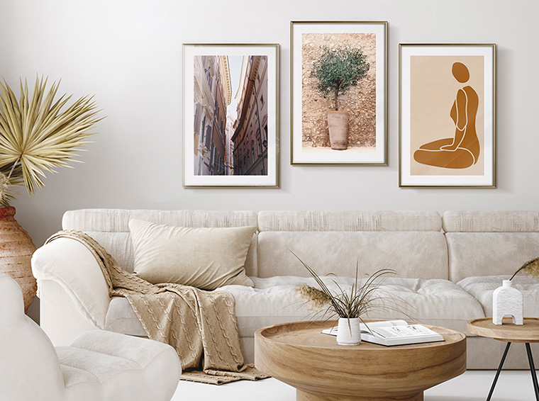
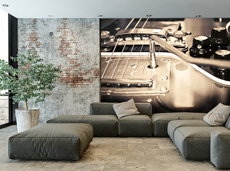
There is no official limit to the number of colours allowed in one room. But the saying "the more the better" does not apply here. Too many colours or too intense shades will make the room the opposite of peace. It can be overwhelming and can create the effect of walls coming closer together. How to combine two colours on the wall? Eliminate unnecessary abundance of colours until you begin to see a balance in them. You can also pay attention to the proportions of each colour you use (focus on one or two primary colours and a few accents), as well as where your colours are (ideally evenly distributed).
"The Whole Is Greater Than the Sum of Its Nonrigid Parts"
When trying to design a colour pattern in the house, have this classic Aristotelian aphorism in your mind. In short, consider the house as a whole. Even if it's a small apartment, the colour transition from one room to another can be confusing, and it won't look good if one room has bright orange and another is bright pink. How to combine colours on wall looking at the entire home space? Choose them by thinking in multiple dimensions and perspectives.
Lux means light
Even the most beautiful colour will look bland without proper light. A proper light can add charm to an interior, lack of light can make idyllic lavender turn grey. Before painting the wall, use a painted or glued sample to see the new colour in both daylight and artificial light. If the colour you have in mind doesn't work, don't go for it. It is enough to apply a different shade or use a mixture. A help from professionals, a finishing company or employees of a store specializing in paints will also be a good thing.
Let your eyes rest
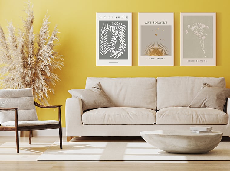
While we support a bold approach to interior design, even the most colourful spaces need places where the eyes can rest. Make sure there is a space free of intense colours in the room, or include large elements in neutral colours to balance the intensity of the colour composition.


Save red for handbags
The way a room looks is a major factor in how you feel when you are in it. And just because you like a colour doesn't necessarily mean it's the best choice for walls. Be careful with your overall colour preferences and consider how you will feel when your favourite colours surround you indoors. Strong red, bottle-green or brown may suit the car body or wardrobe, but these and other strong colours may not work if you wake up and fall asleep surrounded by them. The magic happens where you combine the colours you like with the ability to apply them where they look best.
Choosing the right colour your apartment will most probably define the rest of its interior design and how we will feel in our home. More precisely, a lot can go wrong when choosing your colour set even with the best of intentions. Therefore, it's always a good to know which solutions are a dead end..